

Well, I've spent most of the day on this...and now I've got one BIG headache...all that's left to do is test.
The goal here was to use the whole screen and have larger photos...so, I hope it's going to work! There's more tidying up to do...but I'm brain dead for now...
But, hey...I'm a really bad interior designer, and I'll take all the helpful hint I can get!
NOOOOOO...it didn't work like my test blog did...dang!
ReplyDeleteBut the header looks really good!
ReplyDeleteYeah...I fixed it!!
ReplyDeleteI like it, looks good on my end!!!
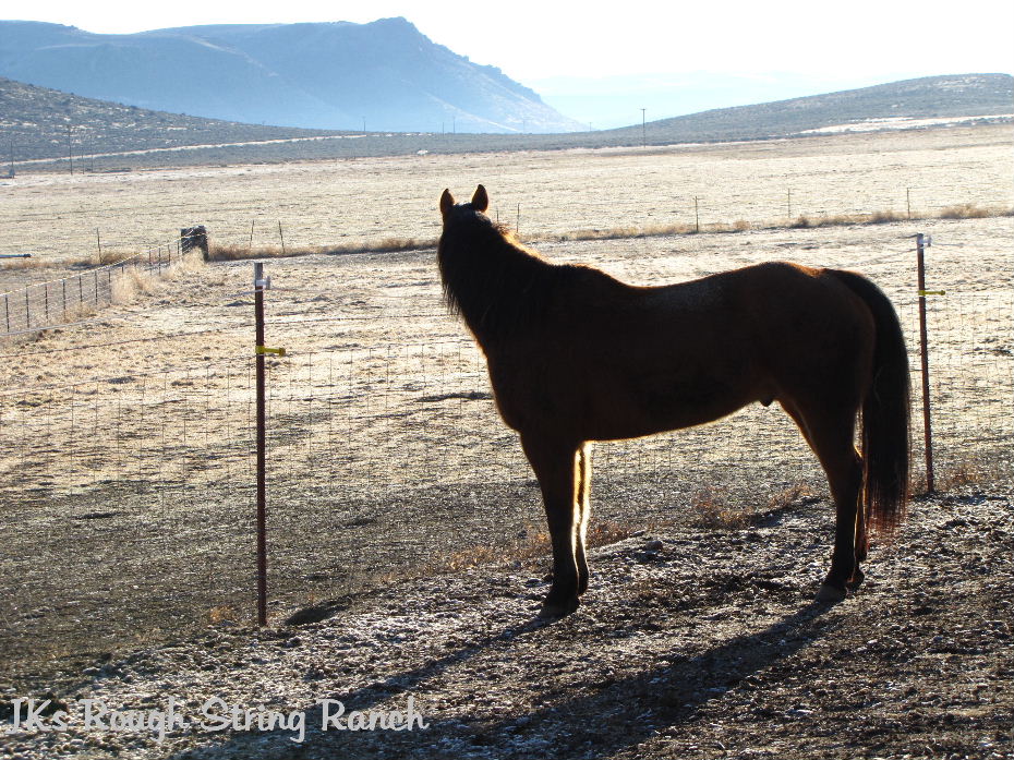
ReplyDeleteThat good lookin' Colt is on the header, alright!!!
How's the boy doing anyway.
I like the bigger pictures and the new layout. Looks good. I like your header. I can't seem to get mine to fit in.
ReplyDeleteI think it looks great! Wish I could figure out this blogger computer stuff.
ReplyDeleteI like the format, but you may want to darken the font on the side bar. It's hard to see on the wooden background. :o)
ReplyDeleteI used to do coding and web design. I am still a moderator of one of the biggest web design sites on the internet. However in the last 2 years I haven't had much time. I need to re-do my blog something bad.
ReplyDeleteWow! Looks good to me. I see on your Saddle Songs you have David Wilke, Cowboy Celidh (pronounced kay-lee) He's from Turner Valley, Alberta and is a friend of my husband. Some darn good music there!
ReplyDeleteI like it.... the sidebars a bit tough to read on the wood background.. but I love wood idea and absolutely love the large pictures!
ReplyDeleteLookin good Gttyup!!!
ReplyDeleteI love the new look!! Nice job!
ReplyDeleteLove that header, gorgeous!!!
Looks fantastic! The wood siding really sets it off...:-))
ReplyDeleteI like it too but I agree that the sidebars are hard to read on the wood background. I've been playing around in the test site too for blogger but it seemed to take forever to figure out and I didn't like any of the layouts I came up with.
ReplyDeleteHey, this looks great. What settings did you use? I'm really impressed.
ReplyDeleteYou did great but now you can help me, I have been wanting to get my pictures bigger also and for the life of me can't figure out how to get them. I still have small ones and if I make them x large in blogger they take out half of the picture to get it bigger.
ReplyDeleteLookin' good! I like it, you did a great job!
ReplyDeleteI like it, the bigger pictures are nice. I havent figured out how to get mine quite the way I want it yet.
ReplyDeleteThanks for the input everyone!
ReplyDeleteI used Blogger in Draft.
Getting everything to look right and be easy to read is the hard part! The process really wasn't too hard at all...there's just lots of decisions to make and what I vision doesn't always come out quite right.
But, there are other options that I'm going to try using (like tabs)...so this will just be a "work in progress."
I found the Blogger in Draft blog a helpful resource.
www.bloggerindraft.blogspot.com
Email me, if I can help anyone else...but it might be the blind leading the blind!
It looks awesome! I'd love to get my blog so that the pics are bigger too. It might just be my screen but it's not easy to read the black font against the purple...I actually dont have a problem with the black type over the wood. :)
ReplyDeleteHi Adventures~The problem is that the text color has to be the same in the posts and on the side bar. I started with a black post background with white text...the white was hard to read over the wood. So I tried the mauve type color with black text. It seems to work better for over the wood. I just went in and lightened up the mauve color and I think the black is easier to read. If not, let me know again. I appreciate the feedback! Have a great weekend!
ReplyDeleteWHOA ---- I like it!!! I like the "board" background! And bigger pictures sure can't hurt any. (I'm in the bifocal phase. LOL)
ReplyDeleteI think I'm going to like it.......It took a long time to load but I think it's because it's windy here and my connection is slow. I really need to change mine too but don't know what I want yet.
ReplyDeleteI really like the new look. :)
ReplyDeleteI like it! and your header photo is exceptional! I didn't know you could change the layout in this way, but its great to have larger pictures!
ReplyDeleteThat's certainly different. I like the bigger pics.I like the colors as well. I loved your Wordless Wednesday.
ReplyDeleteI like it!!
ReplyDeleteSweeeet! I especially like wooden background picture. I've been wondering how to get patterned backgrounds, as I get bored with just solid colors. Yours looks great!
ReplyDeleteAnd Colt is gorgeous in those pics, too.
~Lisa